Choosing Your First Watercolor Palette: Tips for Selecting Colors
Introduction
One of the most important first steps for any budding watercolorist is selecting a suitable color palette. The colors you begin with will not only shape your painting style but will also have a significant impact on how easy—or challenging—the learning process becomes. Choosing the right colors can help you avoid frustration, build confidence, and enjoy the journey of experimentation and growth. A well-chosen palette offers versatility, allowing beginners to explore color mixing, understand basic color theory, and find their own creative voice.
In this guide, we’ll walk you through everything you need to know about picking your first watercolor palette, helping you build a foundation that supports creativity and makes each painting session enjoyable and rewarding.
Understanding the Basics of Watercolor Palettes
A watercolor palette is essentially the set of colors an artist has at hand when painting. It’s more than just a collection of colors—your palette is the foundation of your work, allowing you to mix, blend, and create the perfect shades to bring your vision to life.
It’s also the physical space where you keep your colors (often a plastic or ceramic tray with wells for each color), and it helps organize your paints while giving you room to experiment.
Types of Watercolor Palettes
- Pre-made Sets: These palettes come ready-to-use, often containing a curated selection of colors that work well together. They’re perfect for beginners, as they take the guesswork out of picking colors and usually offer a good balance of primary and secondary shades.
- Pros: Convenient, beginner-friendly, and offer an affordable way to get started with quality colors.
- Cons: Limited choice of colors, and you may not get exactly the hues you’d like to explore.
- Customizable Palettes: With a customizable palette, you select individual colors to create a set tailored to your preferences. This allows for more flexibility and the chance to gradually expand your collection over time.
- Pros: Complete control over color choices, great for artists who want to build a personalized palette as they grow.
- Cons: Can be more expensive and challenging if you’re unsure which colors to choose initially.
A Quick Guide to Color Theory for Beginners
- Primary Colors: Red, yellow, and blue. These are the building blocks of all other colors; they can’t be created by mixing other colors but can be combined to make countless shades and tones.
- Secondary Colors: Created by mixing two primary colors, these include orange (red + yellow), green (yellow + blue), and purple (blue + red).
- Tertiary Colors: These are formed by mixing a primary color with a neighboring secondary color on the color wheel. For example, mixing blue and green creates teal, and combining red and purple results in magenta. Tertiary colors help add depth and versatility to your palette.
Understanding these basics of palettes and color theory will set you up for smoother mixing, richer color combinations, and ultimately, more vibrant artwork! Starting with a manageable set of colors that cover primary, secondary, and a few tertiary shades will give you a great foundation to grow from.
Key Considerations When Choosing a Watercolor Palette
Quality vs. Quantity
- When starting out, it’s easy to get excited and want all the colors, but with watercolor, less is often more! A small set of high-quality colors will actually take you further than a large, cheaper set.
- Why? Higher-quality paints tend to have better pigment strength, meaning a little goes a long way. You’ll get more vibrant colors, smoother blending, and an overall better painting experience.
- Plus, having just a few colors teaches you to mix creatively, helping you discover a wider range of shades on your own rather than relying on a pre-set range.
Pigment Characteristics: Transparency, Granulation, and Staining
- Transparency: Some watercolors are more transparent than others, letting the white of the paper shine through and adding a beautiful depth to your work. Transparent colors are especially great for layering and achieving a glowing effect.
- Granulation: Certain pigments have a grainy texture when they dry (this is known as granulation), which adds a natural, textured look to washes and is perfect for subjects like landscapes or abstract effects.
- Staining: Some colors “stain” the paper, making them harder to lift or erase once applied. This isn’t necessarily bad, but it’s good to know which colors are staining vs. non-staining, especially if you’re still experimenting and making adjustments in your work.
Color Mixing Potential
- One of the best things about starting with a limited palette is learning the magic of color mixing! Some colors blend beautifully together, creating new shades and tones with ease, while others may muddy or dull when mixed.
- For a beginner-friendly palette, look for a warm and cool version of each primary color (for example, a warm red and a cool red, a warm blue and a cool blue). This will let you mix a broader range of colors without needing dozens of tubes.
- Experimenting with color mixing will also help you understand how colors interact, enhancing your control over the hues in your artwork and giving you a better foundation to add new colors over time.
Focusing on these key aspects will help you build a palette that’s both flexible and inspiring, without feeling overwhelming! Remember, learning to mix and match on a smaller scale can lead to stunning results, and the process is half the fun!
Essential Colors for Beginners
It’s easy to get lost when starting out with watercolor. So many options! But here is a simple list to help you out:
Suggested List of Essential Colors
When starting out, a balanced palette with just a few colors can go a long way! Here’s a great beginner-friendly selection:
- Warm Red (e.g., Cadmium Red or Scarlet Lake): Ideal for vibrant, warm mixes and adds life to everything from florals to sunsets.
- Cool Red (e.g., Alizarin Crimson or Permanent Rose): Perfect for creating purples and cooler tones, great for shadows and depth.
- Warm Yellow (e.g., Cadmium Yellow or New Gamboge): A sunny yellow that brings warmth to mixes; excellent for landscapes and adding highlights.
- Cool Yellow (e.g., Lemon Yellow or Hansa Yellow Light): Ideal for mixing greens and cooler shades.
- Warm Blue (e.g., Ultramarine Blue): Adds richness to skies and mixes beautifully with warm colors to create earth tones.
- Cool Blue (e.g., Phthalo Blue or Cerulean Blue): Great for mixing with cool yellows to make vivid greens and is versatile for water, skies, and shadows.
Why These Colors Work So Well
- With just these six colors, you can mix a broad range of hues without feeling overwhelmed by choices. You’ll be able to create beautiful purples, greens, oranges, and earthy neutrals, all by experimenting with different combinations.
- This setup allows beginners to focus on mixing skills rather than juggling too many colors, building confidence and a strong foundation in color blending.
- Limiting the palette also encourages you to understand color temperature (warm vs. cool) and how it affects mood and depth in your paintings—a skill that’s super valuable for watercolorists!
Popular Brands with Beginner-Friendly Palettes
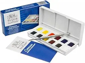
- Winsor & Newton Cotman: This range is affordable and offers great quality for beginners. The Cotman Pocket Box set has a compact selection, including some of these essential colors.
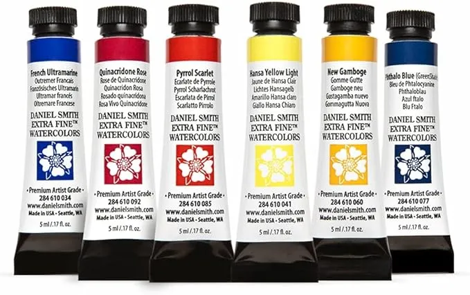
- Daniel Smith Essentials Set: Known for its rich pigments, Daniel Smith’s Essentials set includes six colors that are ideal for mixing and experimenting.
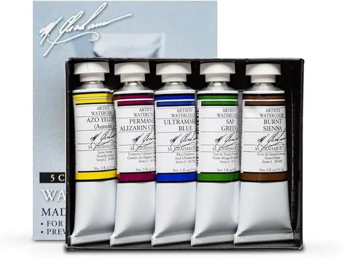
- M. Graham Watercolors: These paints are honey-based, keeping them moist for easy mixing. M. Graham offers customizable sets, letting you start with a few colors and add on as you grow, but you can start with the basic one.
- Sennelier L’Aquarelle: Another high-quality, honey-based option. Sennelier offers starter sets that are excellent for beginners and include a range of vibrant colors.
Starting with this carefully chosen set of colors will keep things simple while allowing you to create a variety of effects and moods in your paintings. As you gain confidence, you can add more colors to your palette and explore your own unique style!
Expanding Your Palette Over Time
- Start Small, Grow Gradually
- When you’re just beginning, a limited palette keeps things simple, allowing you to get comfortable with mixing, blending, and creating a variety of shades. Once you’ve built some confidence and feel familiar with your basic colors, it’s natural to want to explore more!
- Expanding your palette doesn’t have to be overwhelming—adding one or two new colors at a time lets you understand each new shade’s characteristics without feeling lost in too many choices.
- Choose Colors That Fit Your Style or Subjects
- Think about what you enjoy painting most. If you’re drawn to landscapes, for example, adding a few greens (like Sap Green or Olive Green) can make mixing foliage easier and more vibrant.
- For portraits or warm, earthy scenes, consider earthy tones like Burnt Sienna, Raw Umber, or Yellow Ochre, which add depth and warmth to skin tones, natural shadows, and textured backgrounds.
- If you love painting florals, try experimenting with bright colors like Quinacridone Rose, Permanent Violet, or Viridian for beautiful, saturated petal hues.
- You can also check:
- Experiment with Sample Tubes or Half Pans
- Many brands offer sample tubes or half pans, which are small, affordable ways to try out a color without committing to a full tube or pan. This is a great way to experiment with a new shade, see how it mixes with your existing palette, and decide if it’s something you want to use more often.
- When adding new colors, start by swatching and mixing them with your existing colors to see what new shades they can create. Testing each new color in your palette will help you understand its potential and how it fits with your style.
Expanding your palette over time keeps your painting experience fresh and engaging, allowing you to experiment and discover new favorite colors gradually. Each addition becomes a meaningful tool in your creative process, making your palette uniquely yours!
Setting Up and Maintaining Your Palette
Setting up and caring for your watercolor palette might seem like a small detail, but a well-organized and clean palette makes painting smoother and more enjoyable. Proper setup and maintenance help you keep colors vibrant, avoid muddy mixes, and ensure your palette lasts for many creative sessions. Here are a few tips to get started!
Arranging Colors for Easy Access
- Organize your colors in a way that makes sense to you. Many artists arrange them by color family (reds together, blues together, etc.) or by temperature (warm colors on one side, cool on the other).
- Place frequently used colors in the center or most accessible spots, while less-used shades can be placed around the edges. This makes it easy to reach your go-to shades quickly.
- If you have multiple wells or sections, keep mixing areas separate to avoid unintentional color contamination.
Avoiding Cross-Contamination
- To prevent muddy colors, try to keep each color well clean and only use one brush in the well at a time. This helps maintain the purity of each shade.
- Before dipping your brush back into a color, give it a quick rinse to avoid accidentally mixing leftover paint with a fresh color. This small habit keeps your colors vibrant and true to their original shade.
Keeping Your Palette Clean
- After each painting session, take a few minutes to wipe down your palette. Some artists enjoy leaving leftover paint in their palette wells for the next session, which can work well if you know you’ll use them soon.
- If your palette has accumulated dried paint or has become too messy, clean it gently with a damp cloth or sponge, being careful not to scrub too hard, especially on plastic palettes that can scratch.
Proper Palette Care for Longevity
- For ceramic or porcelain palettes, a simple rinse and wipe are usually enough. They’re durable and resistant to staining, making them a great long-term option.
- Plastic palettes are more affordable but can stain over time. Cleaning them regularly helps minimize staining, and occasionally giving them a more thorough wash with mild soap can keep them in good shape.
- Remember to dry your palette after cleaning, especially if it’s made of wood or another material that can absorb moisture.
With a few thoughtful steps, setting up and caring for your palette becomes part of your painting ritual, giving you a fresh and organized start every time you pick up your brush.
Common Mistakes to Avoid
Embarking on your watercolor journey is exciting, but it’s easy to make a few rookie mistakes along the way. By being mindful of these common pitfalls, you can focus on building strong foundational skills and get more enjoyment out of the process.
- Buying Too Many Colors Right Away
- It’s tempting to buy every beautiful color you see, but starting with too many shades can actually hinder your progress. With a huge palette, it’s harder to learn color mixing and can lead to muddy, chaotic results. Start small, and gradually add new colors as you become more comfortable.
- Using Low-Quality Pigments
- Low-cost paints might be attractive, but they often lack the rich pigments and consistency of higher-quality options. These paints can look dull and fade quickly, making it difficult to achieve the vibrant results you’re aiming for. Investing in quality paints, even if it means fewer colors, makes a big difference in your artwork.
- Neglecting Basic Color Mixing Skills
- Color mixing is one of the most important skills in watercolor painting! It’s easy to skip this step, especially with a wide palette, but understanding how colors blend helps you create more harmonious and cohesive pieces.
- Practice mixing colors to see what unique shades you can make; this hands-on learning will give you confidence and improve your control over color in your paintings.
- Rushing the Learning Process
- Watercolor is a medium that rewards patience and practice. It takes time to develop a sense of color intuition and to understand how each pigment behaves. Try to avoid comparing yourself to others or rushing for quick results.
- Embrace the process, experiment with each color, and trust that with practice, your personal style and color preferences will shine through.
By steering clear of these mistakes and focusing on gradual, thoughtful growth, you’ll build a strong foundation in watercolor that will serve you well as your skills evolve. Remember, patience and curiosity are your best tools in this journey!
Focus on versatility and manageability when choosing your palette
Choosing a versatile yet manageable watercolor palette is one of the best steps you can take as a beginner. By starting with a focused selection of high-quality colors, you set yourself up to learn, experiment, and grow without the overwhelm of too many options. This foundation will help you understand color mixing, discover your favorite hues, and ultimately develop your unique artistic voice.
Remember, the process of discovering your style and preferences is all part of the joy of watercolor. Your palette will naturally evolve over time as you gain experience, find colors you love, and explore new techniques.
A final tip: keep a small journal or sketchbook dedicated to your color experiments. Swatching new colors, practicing mixes, and noting what you discover along the way can boost your confidence and create a personal reference you can return to. Above all, enjoy the journey, and let your palette grow with you as you dive deeper into the world of watercolor!